
Easy Speaking
Easy speaking is easy
Language school Easy Speaking is located in Arma loft whose major tenants are representatives of creative occupations. The corporate style was supposed to grab their attention and tell them that the school was specializing in the elementary educational level.
The school’s main focus was on the elementary educational level, which became a clue to us in our search for a visual metaphor. The corporate style of Easy Speaking starts with a logo that refers to the fundamentals of any language – i.e. the alphabet.
To create a logo, we needed a good slab antique-type font that is frequently used in ABC books and dictionaries. After an extensive search, our preference went to the font that met all our demands – FS Clerkenwell Regular developed by British studio Fontsmith.
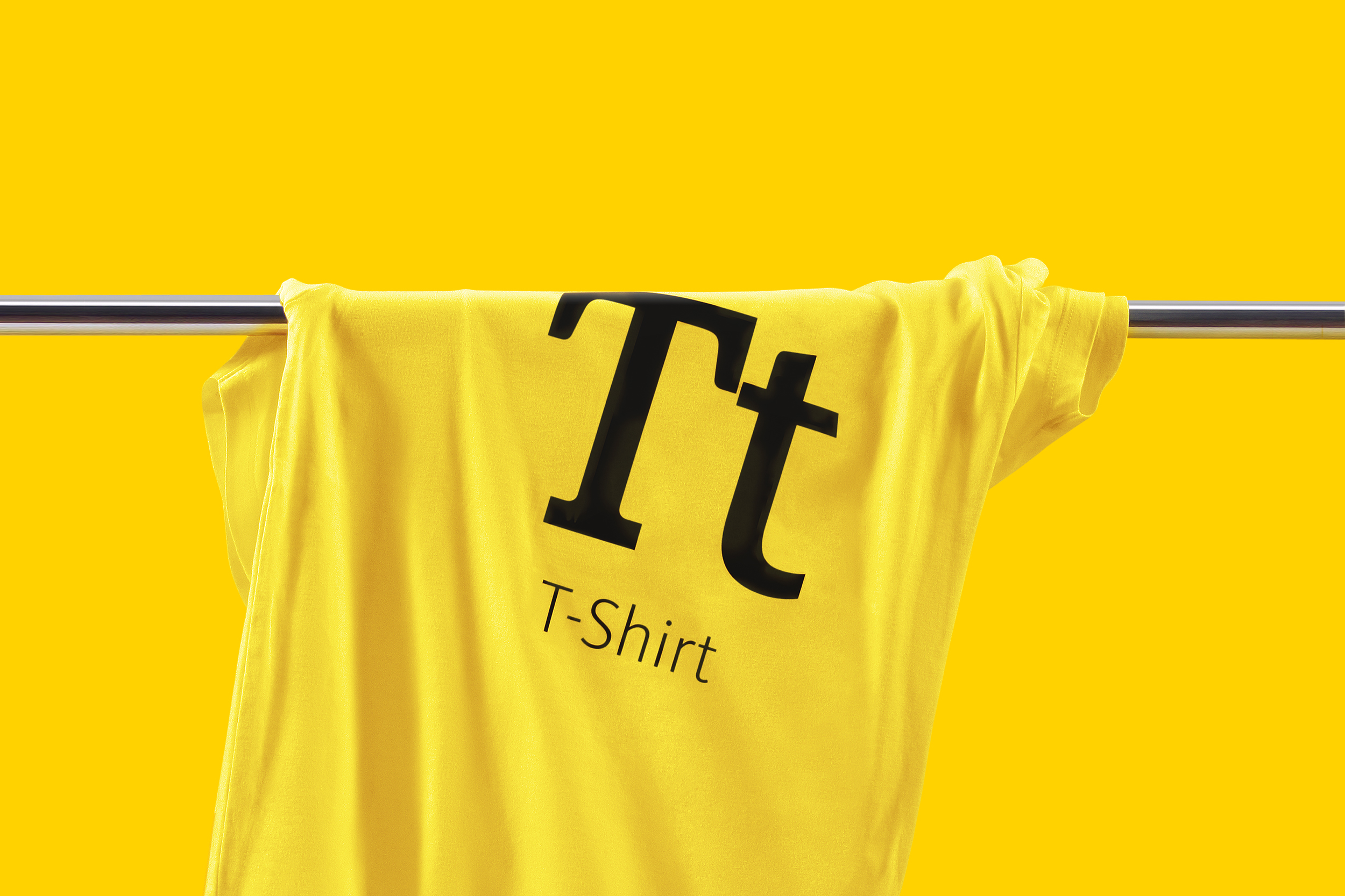
The corporate style was based on one of the methods of learning a language at the basic level, which is memorizing words using cards. Basically, the brand identity of Easy Speaking assumed the teacher’s functions where any medium was turning into a “teaching card”, whether it was a letter form, a flyer or a door plate.
The brand identity of Easy Speaking assumed the teacher’s functions where any medium was turning into a “teaching card”.
The brand identity of Easy Speaking is capable of pre-determining advertising and informational needs in the communications as it reflects the non-standard and creative potential of the language school.
The brand identity of Easy Speaking was supposed to attract attention of the creative cluster and tell it that the school was specializing in the elementary educational level.
Client: Easy Speaking Language school
Awards: Golden Drum, Golden Hammer, KIAF, Red Apple, ADCR RUSSIA, White Square, IDEA!, Russian Design Ranking
2011
Расскажите о вашем проекте и оставьте свои контакты. Мы пришлём презентацию, релевантную вашему запросу, и обязательно с вами свяжемся.