
Al Market
A logo that speaks
to the customer
Al Market is a chain of hard-discounter outlets in Azerbaijan. Our team was engaged to develop the logo and the corporate style concept of the chain.
Ever since the project’s start, the task was to create such a brand identity that would, on the one hand, state directly its belonging to the hard-discounter segment, yet, on the other hand, take into account the local specifics of the consumer behavior.
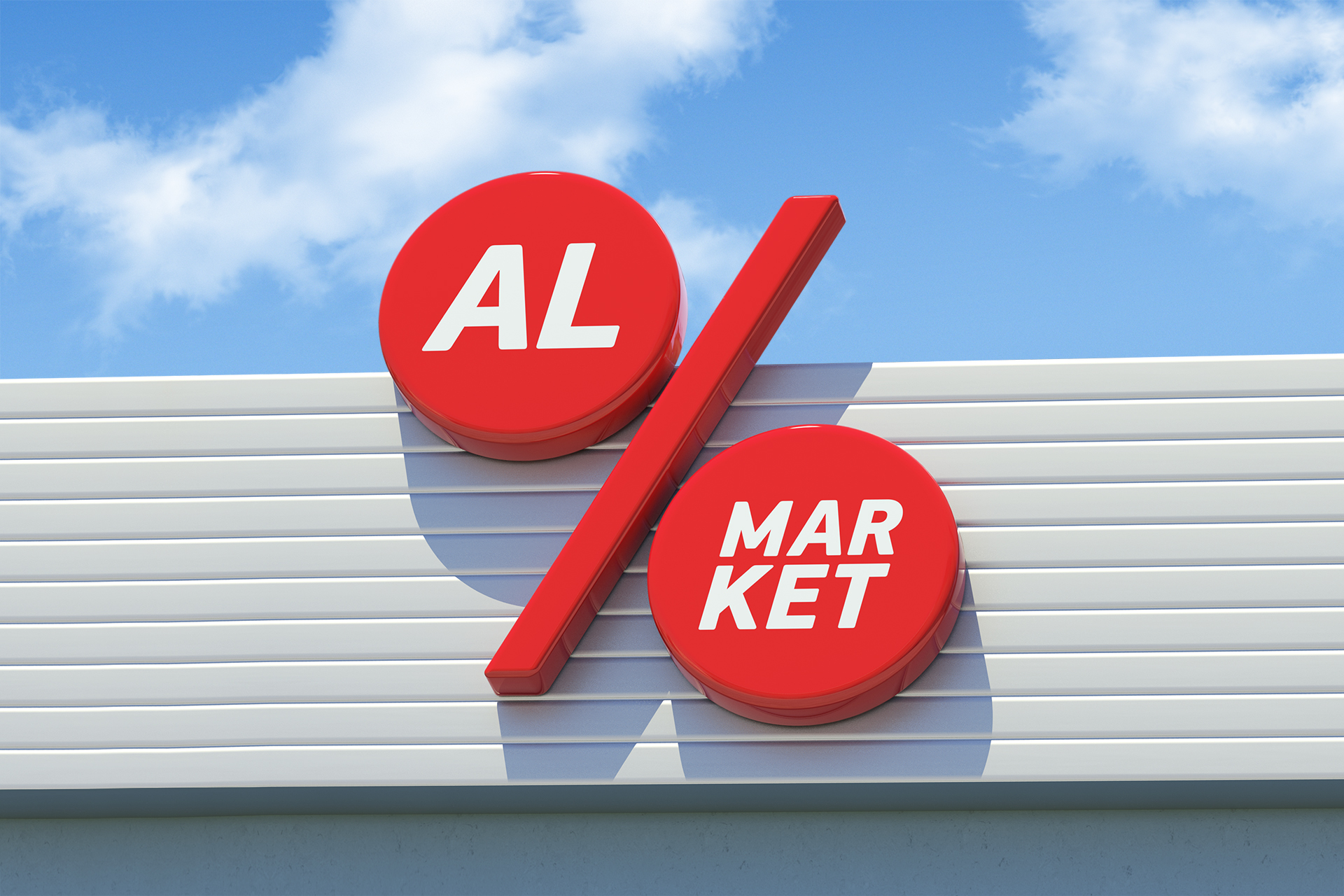
We chose the percentage sign – a plain image of low prices – as the logotype. It was sufficient to signify the format of a hard discounter and we decided to make all other identity elements without solutions that were typical for the segment. We came up with a system of the logo communication with the consumers.
The actual chain name implied interactivity, as the word “AL” means “TAKE/BUY”. By replacing the customary “market” with a product name, a phrase or an image, we receive a wide variety of messages, such as “Take apples” or “Take the freshest”. This move fully functions both in the brand identity and in the advertising communications, and in the design of the private label packaging.
Translation from Azerbaijani: Take / as much as you can.
Translation from Azerbaijani: Take / always fresh.
Translation from Azerbaijani: Buy / more.
Client: Azersun Holding
Awards: Red Dot, KIAF, Golden Drum, IDEA!, White Square
2013
Расскажите о вашем проекте и оставьте свои контакты. Мы пришлём презентацию, релевантную вашему запросу, и обязательно с вами свяжемся.