
Al Market
Speaking packaging
Within the framework of developing
the logo and the corporate style, Tomatdesign team generated packaging design
for the private label of Al Market supermarket chain.
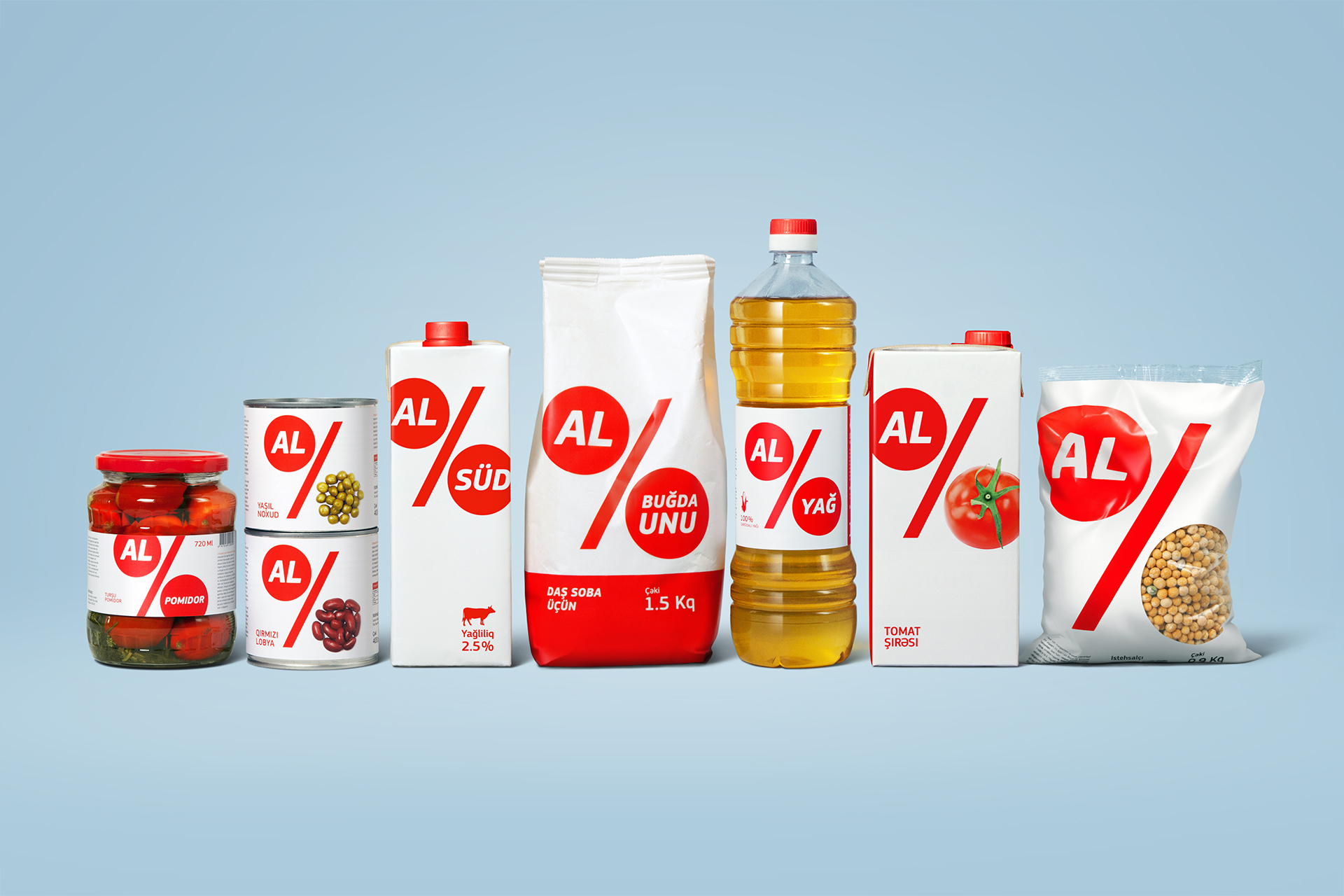
Al Market supermarket chain sells a large number of goods of Azersun holding under its own private label. These goods include such commodity foodstuffs as groats, sugar, butter and goods that are common for a supermarket, namely juices, sausages, meat products, preserves, etc. Our task was to align the private label packaging design with the chain’s corporate style that had already been developed.
We chose the percentage sign – a plain image of low prices – as the logotype. It was sufficient to signify the format of a hard discounter and we decided to make all other identity elements without solutions that were typical for the segment. We came up with a system of the logo communication with the consumers.
The actual chain name implied interactivity, as the word “AL” means “TAKE/BUY”. By replacing “market” in the name with a different phrase or image, we receive a wide variety of messages, such as “Take apples” or “Take the freshest”. This move fully functions both in the brand identity and in the advertising communications, and in the design of the private label packaging.
The concept that had been suggested as supermarket identity easily became the bases of all ranges of products, kinds and types of the private label packaging.
Client: Azersun Holding
Awards: Cannes Lions, Red Dot, Pentawards, Wjite Square, IDEA!, KIAF, Red Apple
2013
Расскажите о вашем проекте и оставьте свои контакты. Мы пришлём презентацию, релевантную вашему запросу, и обязательно с вами свяжемся.