
Knock Knock
Delivering Comfort
Bedding, textiles, and home goods in a stylish minimalist design at a European level of service — this is Knock Knock’s specialty. We have expanded our new brand with a name, positioning, a corporate style, a website and a communications strategy.
Many home goods companies for the Russian segment have been on the market for a long time. They have well-established product selections and operating standards. However, they change slowly and often offer products that do not fit today’s consumers. This applies not only to the quality and design of their goods, but also to everything about them, including level of service, speed and convenience of delivery.
We want to emphasize the modern approach the manufacturer has taken. Home and delivery have become the key semantic fields in creating a brand’s name and positioning. Every home starts at the door. Comfort and coziness lie behind it.
So, the delivery person knocks on the door when bringing your items purchased online. This is where Knock Knock originated — from the sound of items being delivered. It is a playful name that sounds simple and as though it was inviting customers to join the dialogue.
That knock on the door became a metaphor that formed the foundation for the brand’s positioning. Knock Knock is a brand that delivers comfort right to its customers’ door. It “knocks” when you are in need of warmth.
This delivery concept continues throughout the brand’s corporate style. Global logistics services, from FedEx to DHL, use the arrow as their primary symbol. In our case, it has become a simple triangle.
The shape comes from the logo. As DNA forms an infinitely variable modular system, so does our triangle. Thanks to this, the design rids itself of unwanted visual elements, creating a sense of cohesion and orderliness.
This modular system has flexible morphological capabilities, from designing packaging formats to creating decorative patterns.
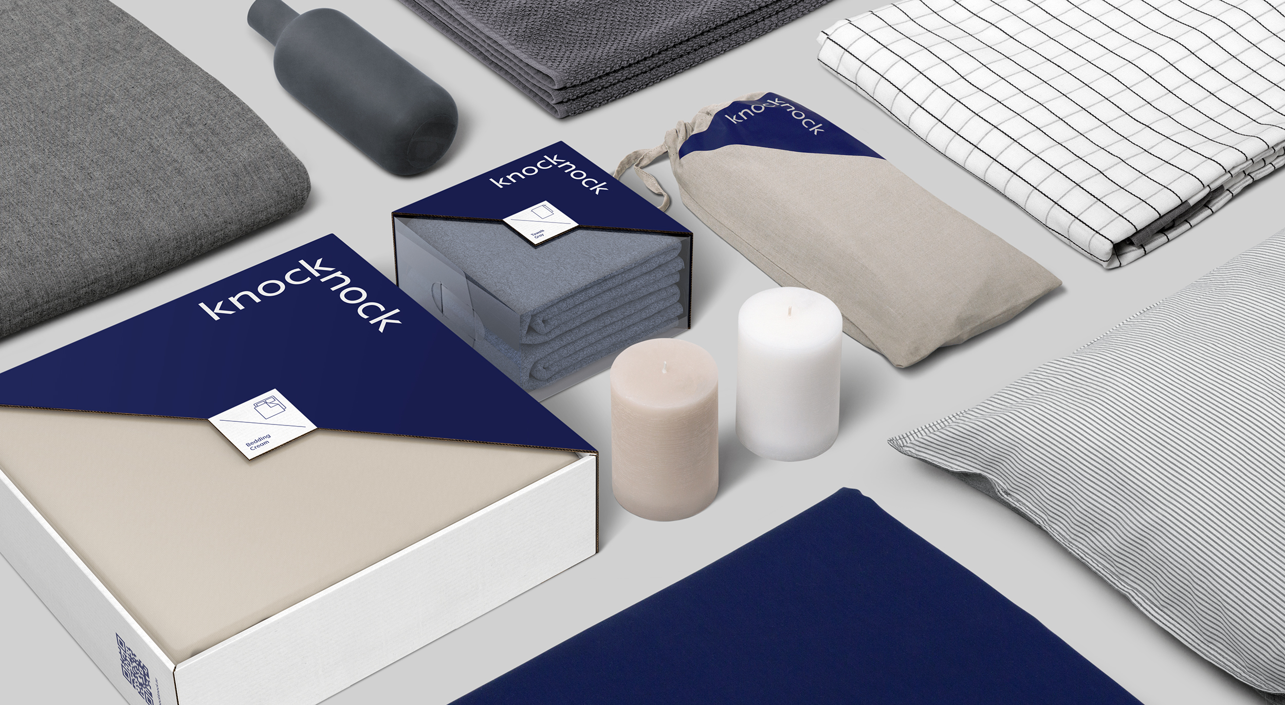
The packaging design is also based on a modular system, a solution that saves the box from visual noise. All that remains is the brand area and the item itself.
This allows the company to play with how the goods are presented. Grouping packages of varying sizes creates a unified composition with a graphic logos pattern.
The triangular logo module gives a balanced consistency throughout the product line’s packaging.
The brand’s color palette, deep blue with soft beige and gray, highlights the premium quality of all the items that combine to form comfort.
Overall, Knock Knock’s corporate identity reflects the Scandinavian minimalism of its products and underscores the brand contemporary approach.
«Knock Knock, did you order comfort?»
Client: Knock Knock
2019
Расскажите о вашем проекте и оставьте свои контакты. Мы пришлём презентацию, релевантную вашему запросу, и обязательно с вами свяжемся.