
New Polyclinic
How to get to the therapist
We developed navigation for medical center New Polyclinic. Within the project framework, the primary challenges to meet were the expedient navigation of the visitors on six floors of a historical building in the center of Moscow whose layout was far from convenient, with low ceilings and a great number of offices and service rooms.
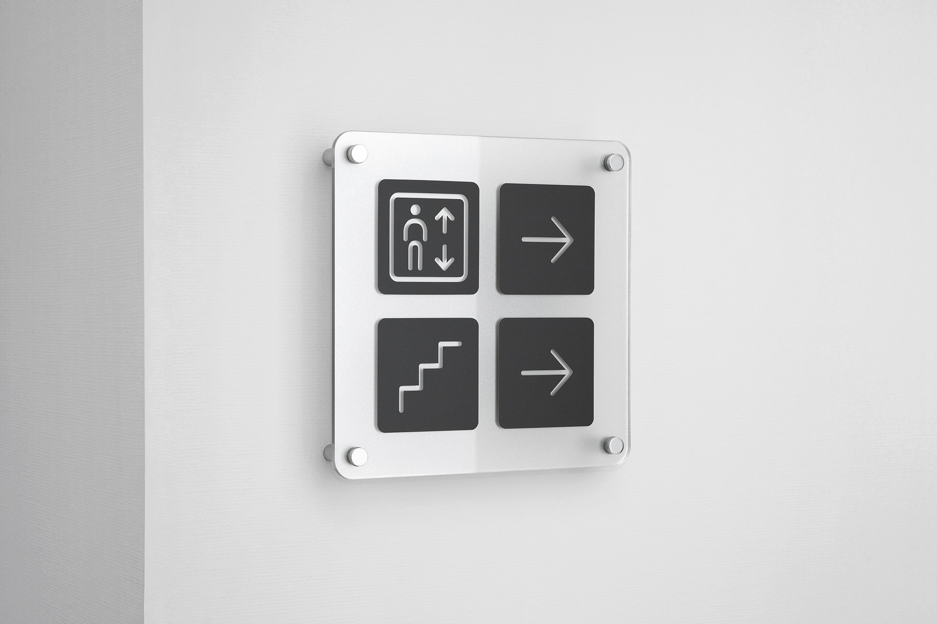
A set of pictograms with unique graphics was generated to back up the textual indications.
Light-weight easy-to-produce structures of the signs and simple graphics allowed us to make the visual environment of the polyclinic aesthetically attractive and more up-to-date.
To help the visitors finding their way and knowing on which floor they presently are, the walls were painted in different colors for different floors.
The navigation was supposed to work equally well against different backgrounds, therefore it was decided to make the direction signs out of a transparent material.
Client: National Medical Company
2014
Расскажите о вашем проекте и оставьте свои контакты. Мы пришлём презентацию, релевантную вашему запросу, и обязательно с вами свяжемся.