
Punkt E
Be Electro
Punkt E is the largest private operator of a charging station network for electric vehicles (EV) in Russia.
In 2019, the Tok Box startup was launched with the mission to install charging stations. During this process, the company came up with an ambitious goal of creating an innovative and scalable charging infrastructure using the best equipment and state-of-the-art IT solutions in order to ensure the sustained development of e-mobility in Russia.
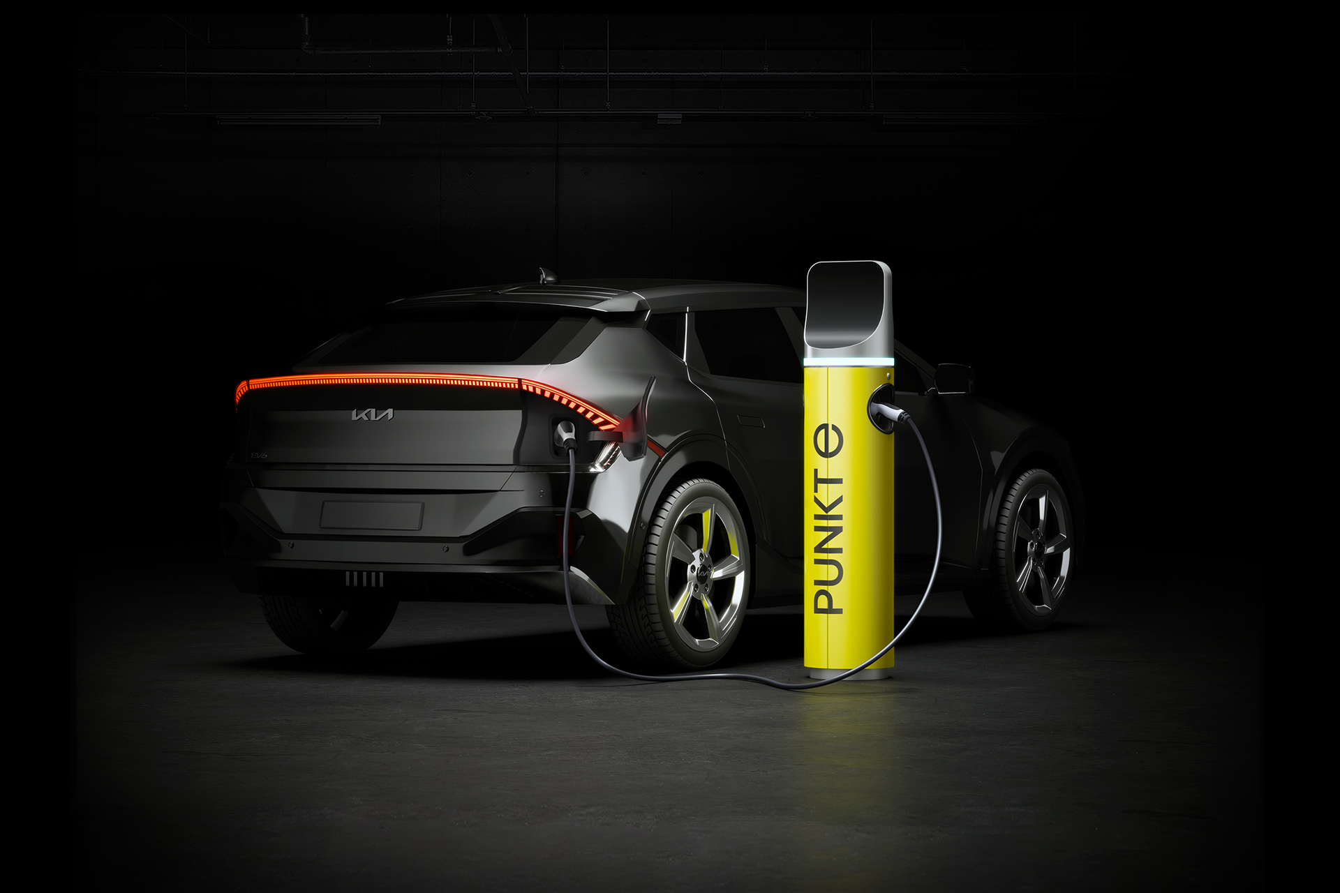
Tok Box approached Tomatdesign to create a new brand’s image. The task involved developing brand positioning, a new name, corporate identity, adaptive design system for charging stations and EV charging points, as well as ensuring the new brand’s presence in the digital space.
Quick, simple and convenient service is now becoming the key factor for EV drivers. It requires special attention to every step of the user’s path, focusing on comfort during the charging process.
Analysis of current consumer needs has led to the idea that the company should become not just an operator of a charging network, but an entity that would bring together a community of EV owners, people who think about the future, a community of groundbreakers and pioneers.
The idea of the new brand is reflected in its mission: to go along the customers’ way towards their goals. By offering modern mobility technologies, the company becomes their guide to new opportunities.
The original TT Punkt E typeface is a customized version of geometric grotesque font TT Fors. The basic set of capital letters also includes an alternative lower-case “e” that refers to the brand’s logo.
The company’s new name is Punkt E. Punkt E is a stop, a passing point on the way from A to B where you can recharge to continue the motion. This is a point that helps people become more free, more modern, more mobile. E-mobile, to be exact.
“Be electro-mobile” sounds both like a call to action and like a motto of a community of EV owners. However, despite the precise wording, the slogan lacked dynamics, emotion, and boldness. The call to action has turned into neologism. Be Electro means be more free and mobile, more than you can imagine.
The concept of a guide from the brand’s positioning was taken further in the corporate identity. The design is inspired by the rugged visual language of traffic navigation: signs, markings, signposts and a bright yellow color used in warning signals.
Thus, for instance, the letter “e” in the logo resembles a road sign, the layout structure is built upon the grid that looks like parking marks, while the corporate pattern stems from the black and white warning lines.
Client: Tok Box
2022
Расскажите о вашем проекте и оставьте свои контакты. Мы пришлём презентацию, релевантную вашему запросу, и обязательно с вами свяжемся.