
Here Pharmacy
I don’t need branding,
I need an adhesive bandage!
Tomatdesign agency developed an integrated project for Zdravservis to launch a new brand of Here Pharmacy chain into the market.
Pharmaceutical company Zdravservis, the major regional supplier of medications and medical products, is launching its own chain of discounter pharmacies. An entirely new project needs everything, including the name, the corporate style, design of the retail facilities, brand platform, communication strategy, solutions for the advertising campaigns; a launch of its own trademark is also envisaged.
We faced a task of developing a strategy of long-term positioning and appearance for the brand of the chain of discounter pharmacies. We had to emphasize the brand’s accessibility for a regular person; it was important to stand out of the range of other pharmacies and create a simple, friendly, easily rememberable image.
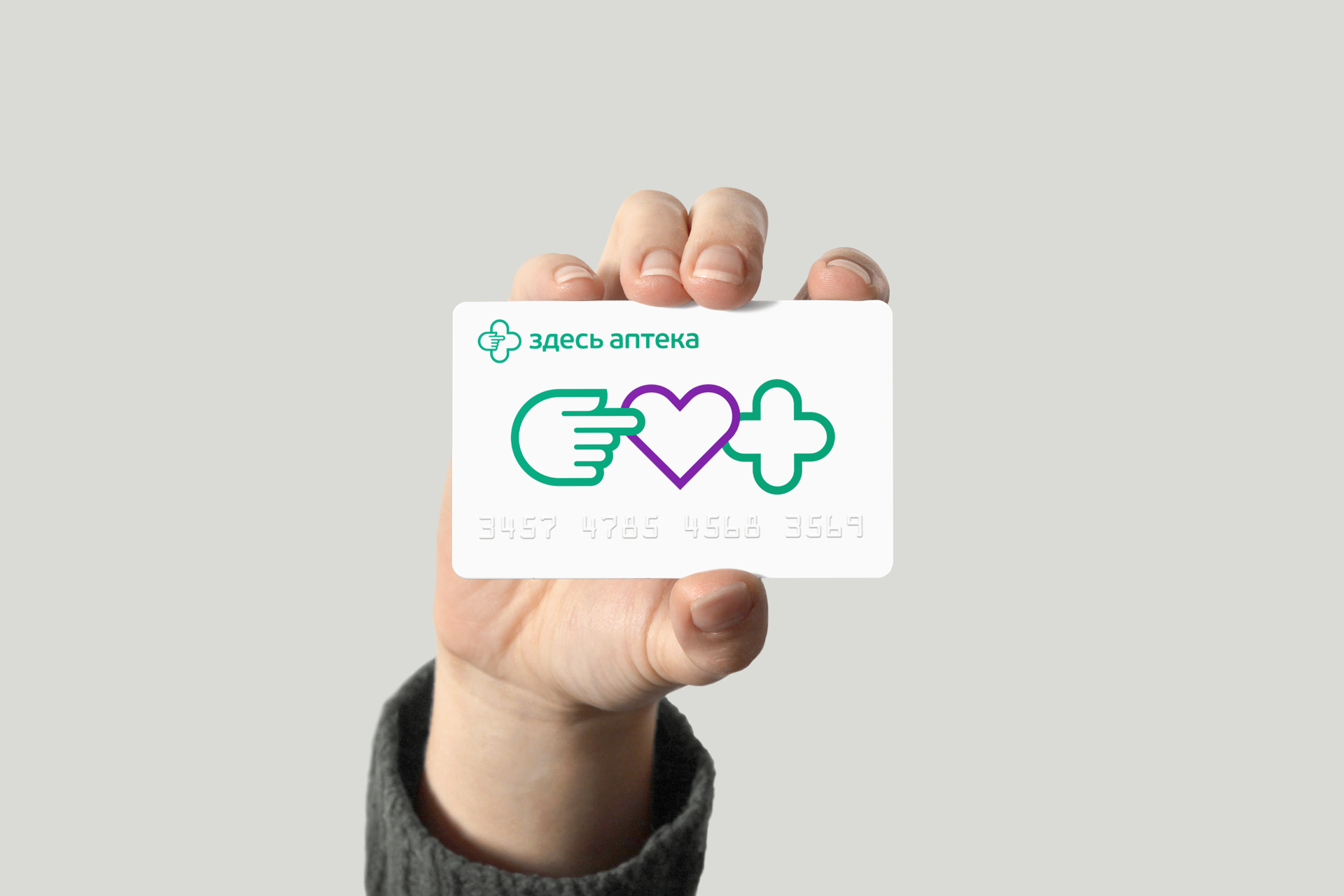
We remove the barriers, exclude the unnecessary and make things simpler, clearer and intuitively understandable. Here Pharmacy is a local drugstore with low prices. We are nearby, our prices are low and, most importantly, everything is clear. This idea is broadcasted everywhere – “Heartburn reliefs are here” on the section sign, “10% discount is here” on the discount card, etc. Need help? Come in! Drops are here, thermometers are here, and sea-buckthorn oil is over here. Such a pharmacy that is… Just a pharmacy!
We remove the barriers, exclude the unnecessary and make things simpler, clearer and intuitively understandable.
We are nearby, our prices are low and, most importantly, everything is clear. Such a pharmacy that is… Just a pharmacy!
We managed to get a place in the category without repeating or squeezing out anyone, as we formed our own niche. We are nearby, our prices are low and, most importantly, everything is clear. Simple messages and design emphasize that things are affordable here, while the communication retains an emotion and care, attention and empathy are felt.
The modular idea of naming not only makes it possible to play with the product names, but also allows involving the customers, telling them stories and creating interesting advertising messages.
Communication does not exaggerate, but conveys the exact offer value the customer is going to receive. No sophistications, no complex wording – you can simply buy an adhesive bandage here. Everything is fair, clear and in a humane manner.
As for the corporate style, we solved the problem of the pharmacy cross symbol which is a mandatory and, honestly speaking, not too convenient additional structure in the pharmacy façade design. We managed to overcome this obstacle by fitting the pharmacy cross into the actual logo.
Client: Zdravservce
2016
Расскажите о вашем проекте и оставьте свои контакты. Мы пришлём презентацию, релевантную вашему запросу, и обязательно с вами свяжемся.