
Here Pharmacy / private label
Here is everything for your health
Pharmaceutical company Zdravservis, the major regional supplier of medications and medical products, has launched a chain of discounter pharmacies.
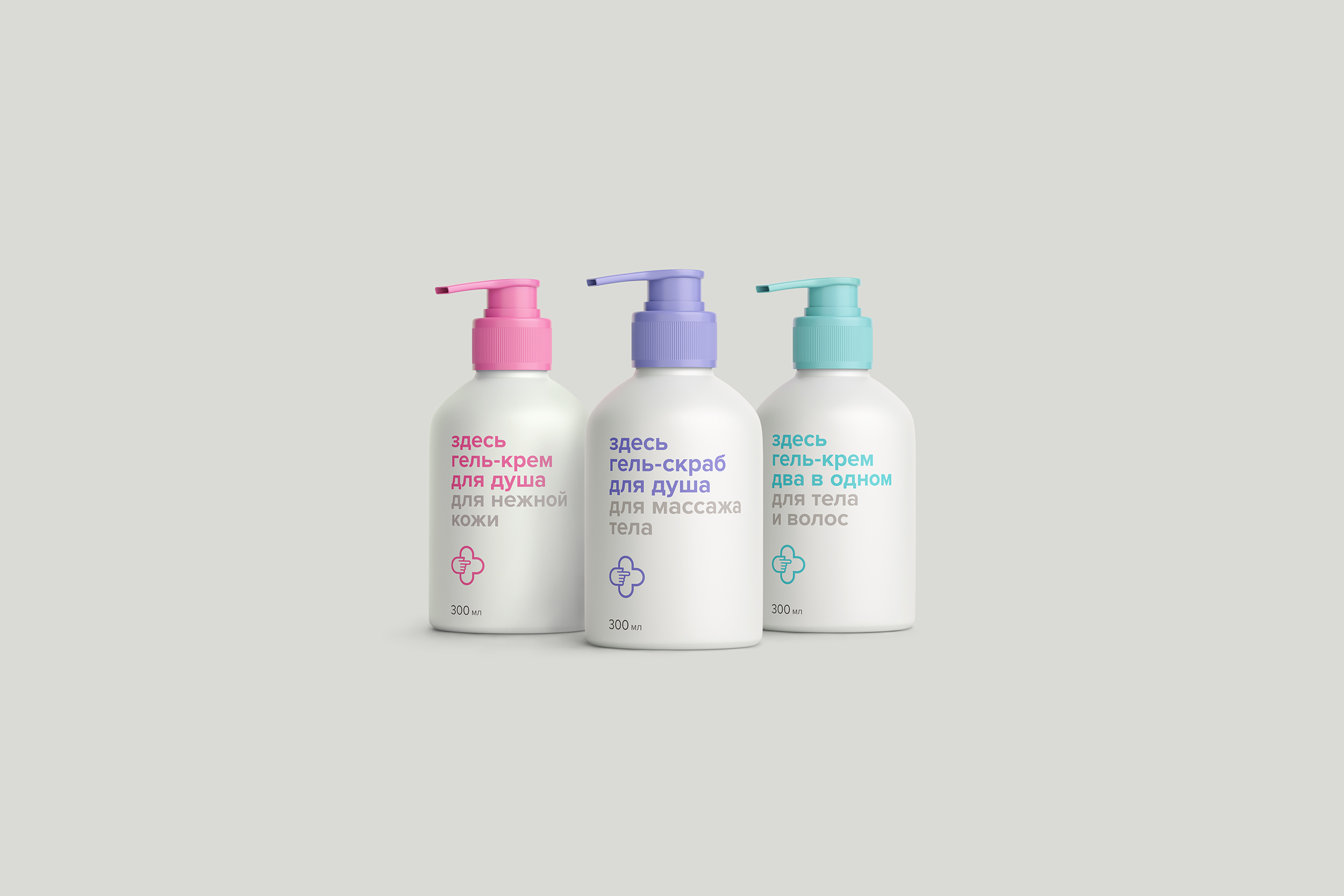
Within the scope of an integrated project for Here Pharmacy chain brand, the team of Tomatdesign developed the design of the private label packaging design. We had to create a simple and easily rememberable image and emphasize the product’s affordability for a regular person.
The modular idea of naming reflects the pharmacy name in the products’ names as well. On every packaging, we communicate with the consumers telling them what this product is, who uses it and how. Laconic design and clear messages create a simple and rememberable image.
When people come to a pharmacy, it is not the packaging design they are seeking, but to have their problem solved quickly.
We managed to infuse the minimalistic design of the packaging with emotions, express empathy and emphasize the caregiving. Communication does not exaggerate, but conveys the exact offer value the customer is going to receive. No complexities, everything is fair, clear and in a humane manner.
We remove the barriers, exclude the unnecessary and make things simpler, clearer and intuitively understandable. Here Pharmacy is a local drugstore with low prices. We are nearby, our prices are low and, most importantly, everything is clear.
Client: Zdravservice
2016
Расскажите о вашем проекте и оставьте свои контакты. Мы пришлём презентацию, релевантную вашему запросу, и обязательно с вами свяжемся.