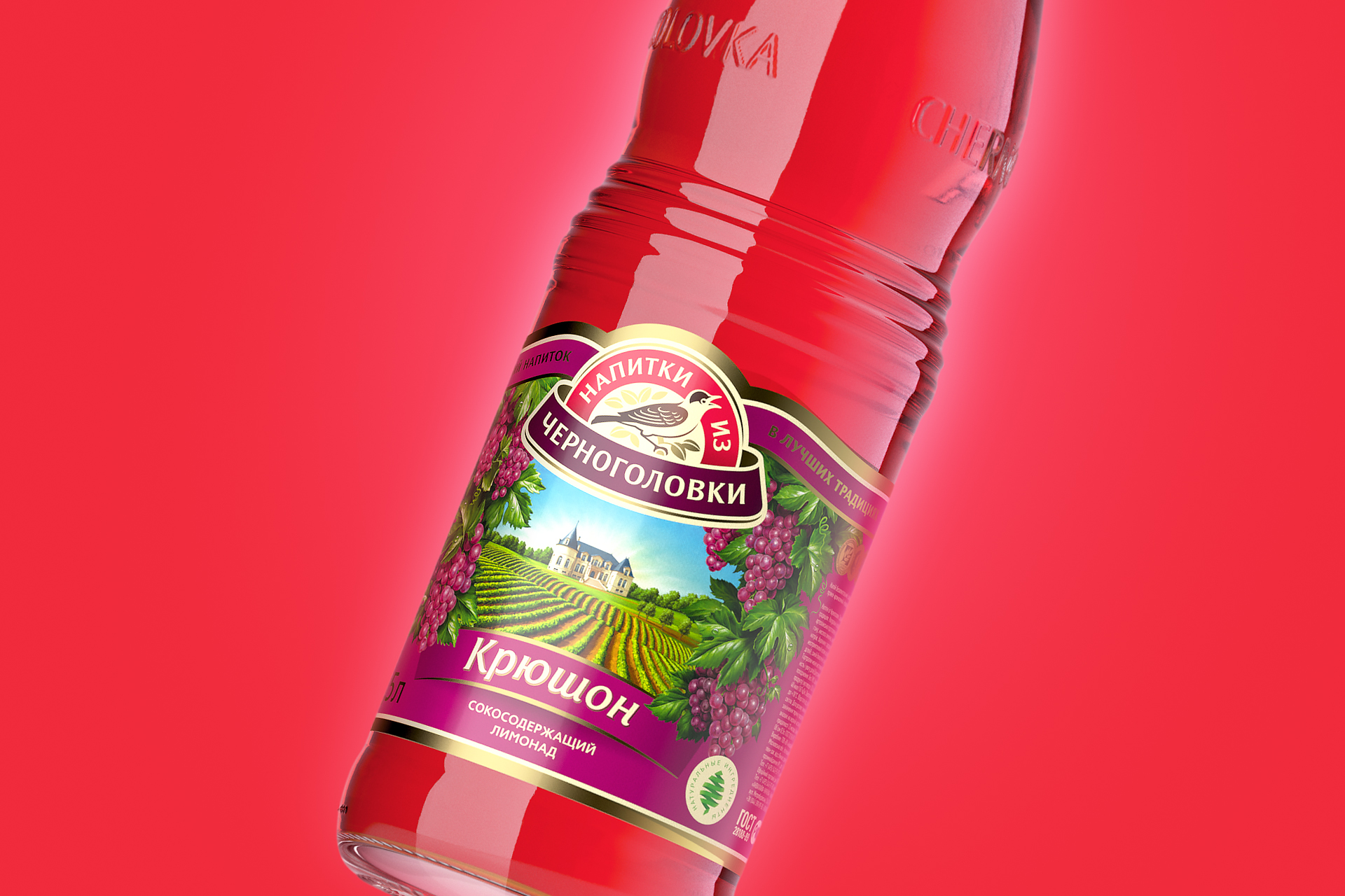

Beverages from Chernogolovka
Drink out
Beverages from Chernogolovka are one of the most popular brands of lemonades not only in Russia but also abroad. The next step in the brand development and growth was full redesign of visual attributes thereof, like logo and brand style, as well as labeling of the whole product range.
Updated brand platform is formed around “authenticity” notion. Trade-mark logo is being enhanced becoming the more active product identifier in the shop-windows, thereby promoting brand in advertising communications.
Image of blackcap (Sylvia atricapilla) in logo has become the major visual change of the brand. Currently, the logo has become the personalized symbol of the brand instead of impersonal set of graphic elements.
Visualization has become the most important part of the project.
Such factors as absolutely different tastes within one product range (taste of one fruit, several fruits, and herbs when one ingredient is not easy to be demonstrated) were considered under label redesign. Therefore, visualization has become the most important part of the project.
Each product was matched with the appropriate scene revealing the topic. Nonstandard compositional approach in demonstrating food-zone that fit into general composition was adopted. “Sun rays” added to the scene have united the label design within the product range.
Previous design
New design
Client: Aqualife
2013
Расскажите о вашем проекте и оставьте свои контакты. Мы пришлём презентацию, релевантную вашему запросу, и обязательно с вами свяжемся.